TEACHA
China as you've never tasted it before
The TeaCha team contacted me to help them imagine the packaging for a truly special product: a series of 5 teas imported from China, combining the millennia-old history of a multifaceted country with Western tastes. The guidelines:
- Distributed in Spar supermarkets, as “Premium,” in a medium-high price range;
- Aimed primarily at a female audience between the ages of 35 and 65+;
A daunting challenge, because when you want to impress everyone, you rarely impress anyone. The first step was to run to the supermarket and observe the other Premium products: I was struck by the enormous quantity of details, patterns, colors, and writing. What stands out amidst the chaos? Silence. Solid colors and a minimal look. The product’s preciousness needed to be highlighted: given the price range, I imagined elegant packaging, like that of a piece of jewelry or a perfume. An exclusive treat for those who desire the best from their taste experience.
Some of the elements I proposed, like the names or colors, were well received, although the team ultimately decided to develop a different product: only three tea varieties instead of five, with a design aimed at a younger, fresher audience. It was a wonderful cross-cultural collaboration.
What I did:
- Created the brand’s visual identity
- Defined the communication style
- Proposed a promotional video
CHINA AS YOU'VE NEVER TASTED IT BEFORE
AWAKEN YOUR SENSES WITH THE FLAVOR OF THE ELEMENTS
A unique design like TEACHA: combining natural elements with the senses and enclosing them in 5 different boxes for every tea.

THE SENSES
VIEW
evocative colors, a different one for each tea, for an unforgettable impact
SMELL
intense perfume to spread around the stand to attract attention
TASTE
offer a unique tasting experience by explaining how to best prepare the infusion

THE SENSES
TOUCH
embossed textures to pique curiosity
HEARING
to experience the rustling of the dried leaves, the delicate falling of the grains of dust, to offer a taste sensation even before having drunk it
EARTH
RELAX E LIFE
Matcha – detoxifying, antioxidant, anti-aging
FIRE
warmth and awakening
Yunnan – diuretic, anti-inflammatory
WATER
energy and balance
Pu’er – aids digestion, immunological properties
AIR
STRENGTH AND CONCENTRATION
Oolong – minerals, rich in antioxidants
THE FIFTH ELEMENT
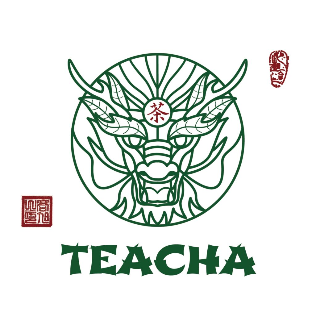
DRAGON
Longjing (dragon fountain) cholesterol, dental health,
relaxing and anti-stress
Symbol present in the logo, it contains all the characteristics of the other elements and represents the flagship product
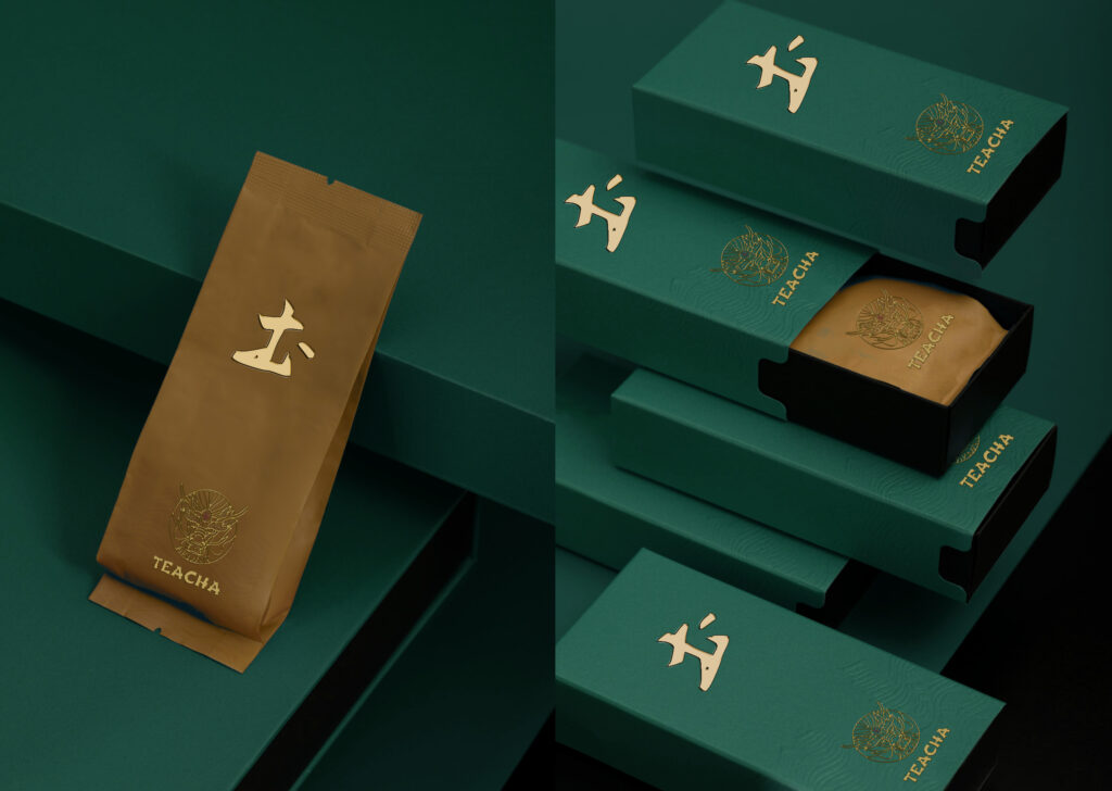
PACKAGING
SYMBOLISM AND MINIMALISM
On the front of the package, insert the character symbolizing the element. Inside the package, a sheet with the tea symbol/character, a description of its origin and properties, and preparation tips.
The logo is on the top. The back of the package contains the product name, ingredients and guaranteed origin, and disposal instructions (eco-friendly, plastic, paper, etc.).
Double packaging: inner plastic – same color for all teas.
Outer cardboard: smooth texture on the top of the package, embossed on the bottom following the lines of the elements (waves, wind, earth, air).
Black stand, logo on the top right side, to make the packages stand out.